How to test colors:
After we work together (or I work alone, if you prefer) to get the right color for each space, you’ll have your own notes about which colors go where – sheen – all those little details. Now it’s up to you or your painter to get these test colors on the wall. Go to the paint store to purchase samples of each color in the finish I specified. While you’re there, grab the paint chips of each color so you can have them for your house diary.
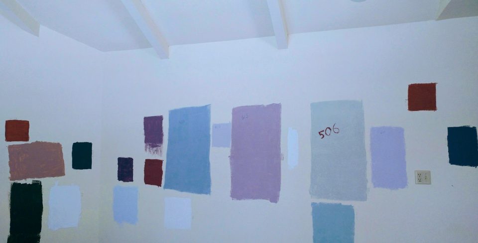
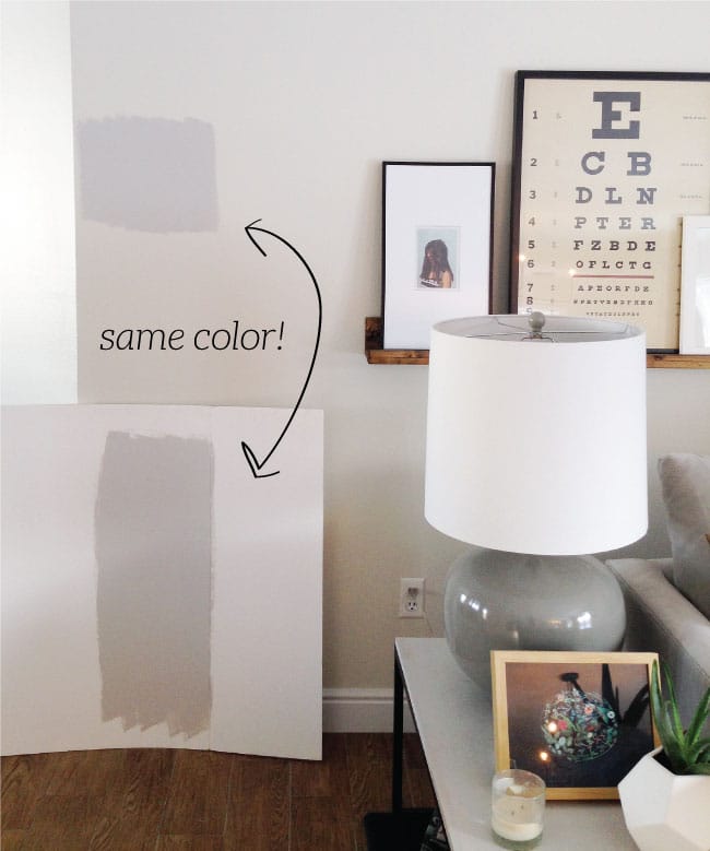
I like the paint to be tested directly on the wall, especially if your walls are textured. This gives you a true representation of how the color will look. However, it’s only a representation of how it will look on that particular wall, so if you can, I recommend painting on both walls in a corner, cleanly up to the trim, and even on the opposite side of the room if it’s a larger space and it’s a color that’s out of your comfort zone. Painting on cardboard or poster board is a good addition to this process so you can hold it up to floors, furniture, countertops, etc. and make sure it works – but that’s what you hired me for. Now, once you have two coats on a three to four foot square patch of paint that’s feathered at the edges so your painter can easily paint over it, don’t just look at it. You want to make a circle with your hands or a piece of white paper to look only at the color itself, not how it reacts to the color that’s currently on the walls. Colors are perceived by the human eye in context with the colors immediately adjacent to them. Check it out during different times of the day, it might change drastically. You might not love a color at every time of day, or on every single wall, but you should love it most of the time.
Other things to know about paint:
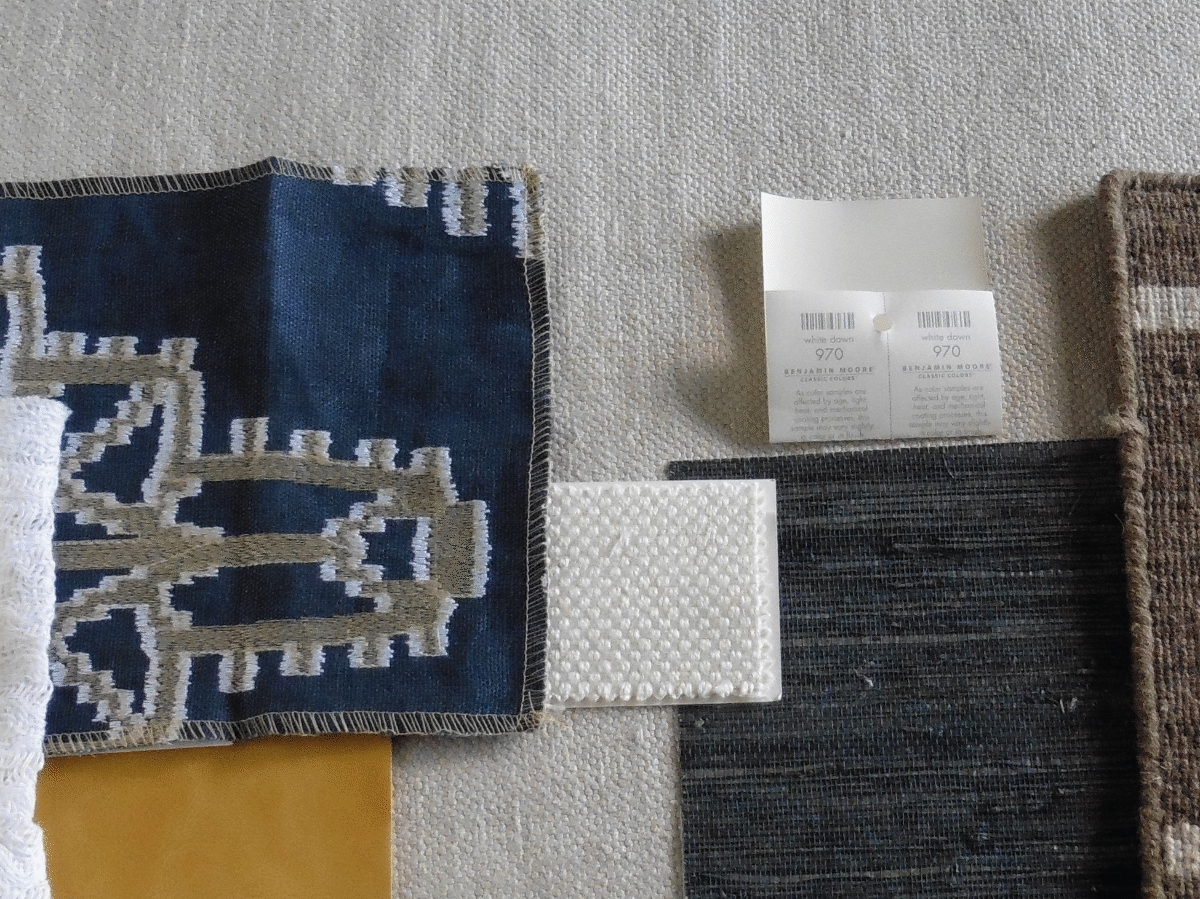
If your painter is using one brand of paint and I’ve specified colors from another brand (because some brands have better charcoals, some are better at whites, etc.) it usually works out but – you’ll want to get a chip of the color at the store I recommended. When you or your painter get the test samples, they should be in whatever brand will be used. Before you do anything, dip your finger into the sample and dab it on the chip. Make sure It matches.
Lighting can affect paint colors enormously. If I think your lighting could be doing better for you and your home, I will definitely tell you. For example, if you remodeled a few years ago when 2,700 lumens was the only option for LED, you’re able to change that now. You might have grown used to it but updating to 3500 or 4,000 will giving you a cleaner light and modernize the space a bit.
More on lighting:
I’m one of those people who are sensitive to lighting, music, and so many other things. It’s a blessing and a curse. I don’t care if a friend’s house isn’t clean, but if the lighting is awful, that’s going to dampen my experience. People get used to the lighting they have. I know that you just go out and buy a light bulb when one goes out but it usually doesn’t match the older light bulb and you have different colors all over the place it’s just crazy! This is when I will usually say “hey, maybe we go outside and visit there?”
Accent walls and other trends:
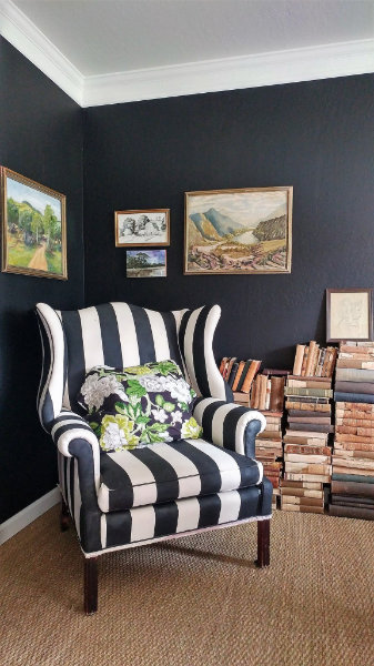
I love that clients are getting savvy and going on the internet and looking at trends and asking me my thoughts. I’m pretty sure they know the answer when they ask me if accent walls are still a thing. I say pretty much no but, if there is a room with a symmetrical wall (or a ceiling) that for some reason calls for different color, I will absolutely choose that. But more and more I am specifying a single color for the main living spaces in a house, and letting the textures, art, and other pieces make the statement. Many times the same color will be completely different depending on where the light is coming from. This can be really cool! There are exceptions to this rule – if the house is older and has cleanly separated rooms with trim around the openings, you can have a little fun with colors, as long as they’re all friends.
Dark colors:
Will not necessarily make a room look or feel smaller, but they will suck the light up and make it feel darker. You will need extra lighting. My black office was super cool, I loved it! But I need light and bright spaces and I couldn’t take it anymore, so I had to paint over it. To be honest, my office is still a work in progress, because it’s still mostly my “old” style. I love the special treasures in it, but the rest of our home is so refreshingly minimalist, so it’s a little jarring.
The internet is not your friend when it comes to actually choosing a paint color. So many websites say they have the 10 best grays or the 20 best whites, etc. Maybe they are great colors but not for every home. Every single home and every single room is different. If I’m working with an existing floor or countertops or natural wood, this is going to dictate which color we choose, not a website.
Now that I’ve said that I’m going to betray it and tell you my go-to colors.
Benjamin Moore White Dove is a soft, totally neutral white for trim and ceilings and walls if you prefer.
Benjamin Moore Super White is even cleaner but still not a cool white. It’s my kitchen and the outside of our house.
Simply White and Chantilly Lace are not in my repertoire. To me, other colors are just more interesting. I’m telling you this because everyone asks me about them.
I’m not going to tell you more because there are so many awesome charcoal grays and blues and greens and soft grays and khakis but it depends on your home, the light and other surfaces. Note that I didn’t say tans or beiges or greiges or yellows or sages or reds. I will choose these colors for you if the house requires them and if you prefer warm tones, but it’s not as modern. I recently chose them for a lovely home and they’re going to look perfect.
An important thing to note while obsessively searching out design help online and looking at images of paint colors in different rooms – these pics are not of your home. You may have different trim, floors, windows, texture, you likely don’t have a cool old stone or brick wall – you get my drift. Your trim may be natural fir that your partner refuses to paint, or KM navajo white, and repainting it is not in your budget. You may have tile or granite that you did not choose. The colors that work well there may not be the colors you are dreaming about. I will choose the best color for these “issues” that work well, while making you happy with the overall scheme.
About trim:
I can’t tell you how many homes have 4 or 5 different trims, on crown, windows, doors and baseboards. It is SUCH an easy thing to switch out! Why spend money on repainting old dated trim when you can update? For a modern home, I like a clean, squared off board for baseboards and (if any), a smaller version on doors and windows (no crown moulding). For a more traditional home, go for something special, don’t just trust your handyman to go to Home Depot. There are many stores that sell unique styles.
Regarding sheen, I always go as low as possible. Many flat or matte paints are washable, so you don’t need to use eggshell in a hallway or stairwell. You also absolutely don’t need to put anything shiny on your kitchen ceiling, unless you are constantly blending things without the top on and getting on a ladder to wash your ceiling.
Lastly:
It’s not just about paint! I think you get it now, and I hope you call me before you do anything! I can help you choose flooring, tiles, counters, carpet, pavers, furniture, before I chose paint! Don’t box yourself in by making these important decisions alone.
I could go on forever but I will let you get on with your beautiful day. I hope this helps 🙂
Scarlett